

Preview
Hey Guys! Today we’re gonna check how to create a fake page transition using a section reveal animation with GSAP. Here is a desktop preview of the final result:
Description
The idea here is to create a “trigger” that can be applied on an anchor link (or a button, an image, or whatever element you want) that – once clicked – will activate a custom animation and reveal a section of our website that was previously hidden.
The effect is pretty similar to a popup function, but has several benefits over the typical overlay function:
- it results less invasive from a user point of view, as the animation created tends to look like a natural page transition.
- the revealed section is structured as a full page with sticky navigation buttons (the back button) to easily come back to the main page content.
- as a designer, you have a complete freedom on the structure and the styles applied to the reaveled content.
- It’s easier to make it responsive using the Visual Builder.
In order to achieve the desired result, we’ll have to “link” the trigger element to the corresponding revealed section. We’ll use the CSS Classes field to do that. Then, our custom JavaScript script will do all the dirty job and apply all the triggers automatically to our page, with the correct animation.
In this example, most of the animations will be managed by an external JS library called GSAP. If you are not familiar with GSAP, I strongly recommend to give it a look. This tool is widely used on the modern frontend development industry to create stunning animations. Even the hugely respected Awwwards platform dedicated a special category for the best animated websites using GSAP.
Custom CSS
Let’s divide this section in three parts:
- How to create a trigger by assigning our classes correctly
- How to link our trigger to the corresponding section
- the custom styles applied to this specific layout
How to create a trigger by assigning our classes correctly
There are two steps to follow in order to set your triggers correctly:
- add the dasrgsap__reveal-trigger class to your element in order to identify this element as a trigger by our JavaScript function
- add a unique class of your choice that will be “linked” to the revealed section.
In our layout, we added the trigger inside the Person Module as an anchor text:
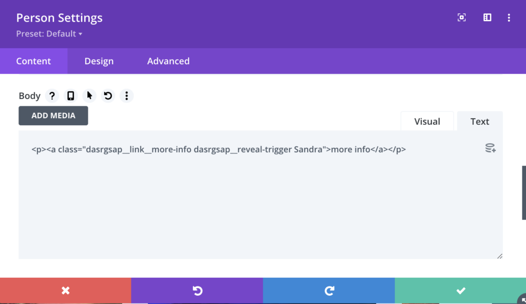
As you can see from the image above, we first added the dasrgsap__link__more-info class in order to style the “more info” anchor link. Then we added the dasrgsap__reveal-trigger class in order to specify that this element is actually a trigger. Finally we added a Sandra class which is our unique class that link the trigger to our corresponding section.
How to link our trigger to the corresponding section.
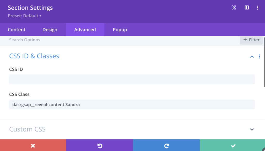
Once we set up our trigger, we can focus on the revealed section settings. It follows the exact same logic:
- first we need to specify that this section is actually a revealed section. To do so, we just need to add the dasrgsap__reveal-content class to our section.
- then we need to add the unique class that we assigned to our trigger. In our case: Sandra.
Here is how our revealed section settings looks like:
The custom styles applied to this specific layout
Most of the CSS codes used here are totally optional, and specifically related to the “main page” styles such as the the person’s grid, the smooth transition effect on hover (for desktop only), the stagger reveal effect of each person’s information, etc… All these styles are not needed to run our section reveal animation.
If you are going to apply the same reveal animation without the unnecessary CSS codes applied to this specific layout, make sure to copy/paste the following styles to your stylesheet:
/* NO BODY SCROLLING WHEN CONTENT IS OPEN */

body.dasrgsap__content--open {
  overflow: hidden;
}


/* HIDE HEADER & FOOTER WHEN THE CONTENT IS OPEN */

.et-l.et-l--footer.hide,
.et-l.et-l--header.hide {
  position: relative;
  z-index: -1;
}
/* BLOCK REVEAL */

.dasrgsap__reveal-content {
  position: fixed !important;
  width: 100%;
  height: 100%;
  min-height: 100vh;
  overflow: scroll;
  z-index: 1000;
  -webkit-transform: translateY(100%);
  transform: translateY(100%);
  top: 0;
  left: 0;
}


/* BACK BUTTON */

.dasrgsap__back-button__row {
  position: sticky !important;
  top: 0;
  z-index: 999;
}

.dasrgsap__back-button {
  cursor: pointer;
  width: -webkit-fit-content !important;
  width: fit-content !important;
  width: -moz-fit-content !important;
  position: relative;
  -webkit-transition: .3s all ease;
  -o-transition: .3s all ease;
  transition: .3s all ease;
}

.dasrgsap__back-button::before {
  content: '';
  position: absolute;
  background-color: var(--dasrgsap__back-button__bg-color) !important;
  width: 36px;
  height: 36px;
  top: 50%;
  left: 0;
  -webkit-transform: translateY(-50%);
  transform: translateY(-50%);
  border-radius: 50px;
  -webkit-transition: .3s all ease;
  -o-transition: .3s all ease;
  transition: .3s all ease;
}

.dasrgsap__back-button:hover::before {
  width: 100%;
}

.dasrgsap__back-button .et_pb_blurb_content {
  display: -webkit-box;
  display: flex;
  -webkit-box-align: center;
  align-items: center;
  -webkit-box-pack: center;
  justify-content: center;
}

.et-db #et-boc .et-l .dasrgsap__back-button.et_pb_blurb_position_left .et_pb_blurb_container,
.et-db #et-boc .et-l .dasrgsap__back-button.et_pb_blurb_position_right .et_pb_blurb_container {
  vertical-align: middle;
}

.dasrgsap__back-button .et_pb_module_header {
  padding: 0;
}

.dasrgsap__back-button .et_pb_main_blurb_image {
  margin: 0;
}
However, if you do want to use this team section “as it”, you are welcome to do so. There is one thing that need your attention though: on line 49 of the CSS code module, we decided to add an aspect ratio of 3/4 to our images.
.et-db #et-boc .et-l .dasrgsap__testimonial__col .et_pb_team_member_image img {
  height: 100%;
  -o-object-fit: cover;
  object-fit: cover;
  aspect-ratio: 3/4; /* Change this value to whatever aspect ratio you want to apply */
}
While this aspect ratio looks fine with the image format we inserted, it may not be suited for all cases. Make sure to update the desired aspect ratio there, and the images should be automatically resized correctly.
Here is the complete custom CSS used in this layout. Whenever you need to copy/paste it to your website, you can quickly do it by pressing the button below the code window, and it will copy all the code to your clipboard.
<style>
/*
Template: Section Reveal using GSAP
Author: Maxime Beguin
Company: Divi Agency
URL: https://divi.agency/
Version: 1.0.0
Licence: MIT
*/

:root {
  --dasrgsap__moreinfo__text-color: red;
  --dasrgsap__moreinfo__text-color--hover: red;
  --dasrgsap__back-button__bg-color: #fff;
}


/* NO BODY SCROLLING WHEN CONTENT IS OPEN */

body.dasrgsap__content--open {
  overflow: hidden;
}


/* HIDE HEADER & FOOTER WHEN THE CONTENT IS OPEN */

.et-l.et-l--footer.hide,
.et-l.et-l--header.hide {
  position: relative;
  z-index: -1;
}


/* PERSON IMAGE AND DESCRIPTION*/

.et-db #et-boc .et-l .dasrgsap__testimonial__col .et_pb_team_member_image {
  max-width: none;
  width: 100%;
  -webkit-transition: .3s all ease;
  -o-transition: .3s all ease;
  transition: .3s all ease;
}

.et-db #et-boc .et-l .dasrgsap__testimonial__col .et_pb_team_member_image img {
  height: 100%;
  -o-object-fit: cover;
  object-fit: cover;
  aspect-ratio: 3/4;
}

.et-db #et-boc .et-l .dasrgsap__testimonial__col .et_pb_team_member_description {
  padding: 20px;
}


/* MORE INFO ANCHOR LINK */

.dasrgsap__link__more-info {
  color: var(--dasrgsap__moreinfo__text-color);
  -webkit-transition: .3s all ease;
  -o-transition: .3s all ease;
  transition: .3s all ease;
  cursor: pointer;
  position: relative;
}

.dasrgsap__link__more-info:hover {
  color: var(--dasrgsap__moreinfo__text-color--hover);
}

.dasrgsap__link__more-info::after {
  content: '';
  position: absolute;
  bottom: 0;
  left: 0;
  width: 0%;
  height: 1px;
  background-color: var(--dasrgsap__moreinfo__text-color--hover);
  -webkit-transition: .3s all ease;
  -o-transition: .3s all ease;
  transition: .3s all ease;
}

.dasrgsap__link__more-info:hover::after {
  width: 100%;
}


/* SOCIAL ICONS */

.dasrgsap__testimonial__col .et_pb_member_social_links li:last-child {
  margin-right: 0 !important;
}


/* BLOCK REVEAL */

.dasrgsap__reveal-content {
  position: fixed !important;
  width: 100%;
  height: 100%;
  min-height: 100vh;
  overflow: scroll;
  z-index: 1000;
  -webkit-transform: translateY(100%);
  transform: translateY(100%);
  top: 0;
  left: 0;
}


/* BACK BUTTON */

.dasrgsap__back-button__row {
  position: sticky !important;
  top: 0;
  z-index: 999;
}

.dasrgsap__back-button {
  cursor: pointer;
  width: -webkit-fit-content !important;
  width: fit-content !important;
  width: -moz-fit-content !important;
  position: relative;
  -webkit-transition: .3s all ease;
  -o-transition: .3s all ease;
  transition: .3s all ease;
}

.dasrgsap__back-button::before {
  content: '';
  position: absolute;
  background-color: var(--dasrgsap__back-button__bg-color) !important;
  width: 36px;
  height: 36px;
  top: 50%;
  left: 0;
  -webkit-transform: translateY(-50%);
  transform: translateY(-50%);
  border-radius: 50px;
  -webkit-transition: .3s all ease;
  -o-transition: .3s all ease;
  transition: .3s all ease;
}

.dasrgsap__back-button:hover::before {
  width: 100%;
}

.dasrgsap__back-button .et_pb_blurb_content {
  display: -webkit-box;
  display: flex;
  -webkit-box-align: center;
  align-items: center;
  -webkit-box-pack: center;
  justify-content: center;
}

.et-db #et-boc .et-l .dasrgsap__back-button.et_pb_blurb_position_left .et_pb_blurb_container,
.et-db #et-boc .et-l .dasrgsap__back-button.et_pb_blurb_position_right .et_pb_blurb_container {
  vertical-align: middle;
}

.dasrgsap__back-button .et_pb_module_header {
  padding: 0;
}

.dasrgsap__back-button .et_pb_main_blurb_image {
  margin: 0;
}


/* RESPONSIVE SETTINGS */


/* --TABLET & DESKTOP */
/* SET THE GRID VIEW */

@media screen and (min-width: 768px) {
  .dasrgsap__testimonial__col {
    display: grid;
    grid-template-columns: repeat(auto-fit, minmax(280px, 1fr));
    grid-gap: 40px;
  }
}

/* --DESKTOP ONLY */

@media screen and (min-width: 981px) {
  .et-db #et-boc .et-l .dasrgsap__testimonial__col .et_pb_team_member_image {
    height: 100%;
  }

  /* PERSON HOVER SETTINGS */
  .et-db #et-boc .et-l .dasrgsap__testimonial__col .et_pb_team_member_description {
    position: absolute;
    top: 50%;
    left: 50%;
    opacity: 0;
    -webkit-transform: translate(-50%, -50%);
    transform: translate(-50%, -50%);
  }
  .et-db #et-boc .et-l .dasrgsap__testimonial__col .et_pb_team_member_description>* {
    text-align: center;
  }
  .et-db #et-boc .et-l .dasrgsap__testimonial__col .dasrgsap__staff-member:hover .et_pb_team_member_image {
    opacity: 0.1;
  }
  .et-db #et-boc .et-l .dasrgsap__testimonial__col .dasrgsap__staff-member:hover .et_pb_team_member_description {
    opacity: 1;
  }

  /* FADE-IN & STAGGERING ANIMATION */
  .dasrgsap__staff-member:hover .et_pb_team_member_description>* {
    -webkit-animation: dasrgsap__fade-in;
    animation: dasrgsap__fade-in;
    -webkit-animation-delay: calc(var(--dasrgsap__order) * 100ms);
    animation-delay: calc(var(--dasrgsap__order) * 100ms);
    -webkit-animation-duration: .3s;
    animation-duration: .3s;
    -webkit-animation-fill-mode: forwards;
    animation-fill-mode: forwards;
    opacity: 0;
  }
  .dasrgsap__staff-member .et_pb_team_member_description>.et_pb_module_header {
    --dasrgsap__order: 0;
  }
  .dasrgsap__staff-member .et_pb_team_member_description>.et_pb_member_position {
    --dasrgsap__order: 1;
  }
  .dasrgsap__staff-member .et_pb_team_member_description>div {
    --dasrgsap__order: 2;
    margin-top: 10px !important;
  }
  .dasrgsap__staff-member .et_pb_team_member_description>ul.et_pb_member_social_links {
    --dasrgsap__order: 3;
  }
}


/* CUSTOM ANIMATION */

@keyframes dasrgsap__fade-in {
  0% {
    opacity: 0;
    -webkit-transform: translateY(40px);
    transform: translateY(40px);
  }
  100% {
    opacity: 1;
    -webkit-transform: translateY(0);
    transform: translateY(0);
  }
}


/*VISUAL BUILDER ONLY*/

.et-fb-root-ancestor .dasrgsap__reveal-content {
  position: relative !important;
  width: 100%;
  height: auto;
  z-index: 1000;
  -webkit-transform: translateY(0%);
  transform: translateY(0%);
}

.et-fb-root-ancestor .dasrgsap__reveal-content>*>*>* {
  visibility: visible;
}

.et-fb-root-ancestor .et-db #et-boc .et-l .visual-builder-onlly__code-module-style {
  display: block;
  color: #fff;
  background: #ef5858;
  border: 1px dashed #ffffff;
  padding: 20px;
  text-align: center;
}

.visual-builder-onlly__code-module-style {
  display: none;
}
</style>Custom JavaScript
Here is where all the magic happens. But let’s divide the code into two different parts:
- How to “link” the trigger and the corresponding revealed section
- the gsap animations
How to “link” the trigger and the corresponding revealed section
What we want our script to do is to check each trigger in the page, retrieve the classes inside each trigger and extract the unique class assigned to it in order to “link” it to corresponding section. To do that we’ll get the index number of the dasrgsap__reveal-trigger class, and look after the class next to it (that’s why both classes should be placed respecting the correct order):
let revealClassName = String(listClassName[listClassName.indexOf(listClassName.find(element => element === 'dasrgsap__reveal-trigger')) + 1])Once we correctly stored the unique trigger class inside our revealClassName variable, we can then target the correct selector with jQuery:
const sectionReveal = $('.dasrgsap__reveal-content.' + revealClassName);
const colReveal = $('.dasrgsap__reveal-content.' + revealClassName + ' .et_pb_column');
Now that we are targeting the correct section, we can start animating it.
The GSAP animation
First of all, let’s initialize the gsap script by assigning a new timeline to our tween variable:
// GSAP SETTINGS
    let tween = gsap.timeline({paused: true});
We can now add new animations to our timeline using .from, to, .fromTo objects. The first parameter is the targeted element. The second parameter is the animation we want to apply:
// HOME SECTION FADE OUT
    tween.to(homeSection, {
        duration: 0.4,
        autoAlpha: 0,
        y: 40
    });
In this example, we are telling GSAP to target all the elements inside the main section, and to transform them with opacity:0 and top:40px for a duration of 400ms.
Now we’ll slide up the revealed section from bottom to top:
// SECTION REVEAL ANIMATION
    tween.to(sectionReveal, {
        duration: 0.6,
      	delay: 0.2,
        y: 0,
        ease: "expo"
    });
The same logic applies here. We are telling GSAP to wait 200ms before firing up the animation. Once the delay is over, we want the section to move to top: 0 using a transition: ease animation for the duration of 600ms.
And finally, the column reveal animation:
// COLUMNS REVEAL ANIMATION
    tween.fromTo(colReveal, {
      	delay: 0.4,
      	clipPath: "polygon(-20% -20%, 120% -20%, 120% -20%, -20% -20%)"
    },
    {
        duration: 0.3,
        ease: "power1.inOut",
        stagger: 0.15,
        clipPath: "polygon(-20% -20%, 120% -20%, 120% 120%, -20% 120%)"
    }, "=-0.4");
We are telling GSAP to:
- wait 400ms before firing the animation and start the animation by applying a clip-path polygon to cover the entire columns
- once the animation is fired, the clip-path polygon change from a rectangle to a single line on the bottom, thus the “fold down” effect. We also added a stagger property, which mean all the columns will be animated one by one with a delay of 150ms between each columns.
Now that all the animations have been stored inside our timeline variable. we just need to “play” the timeline every time the trigger element is clicked:
// PLAY ANIMATIONS WHEN THE TRIGGER IS CLICKED
    $(this).on('click', function(e){
      e.preventDefault();
      tween.play();
    });
and the same logic is applied to reverse the animations when the back button is clicked:
// BACK BUTTON - REVERSE ANIMATION
    backButtons.on('click', function(){
      tween.reverse();
    });
Here is the complete custom JavaScript used. Again, if you just want to copy/paste the code, feel free to use your Copy to Clipboard button below the code window.
<script src="https://cdnjs.cloudflare.com/ajax/libs/gsap/3.7.1/gsap.min.js" crossorigin="anonymous" referrerpolicy="no-referrer"></script>
<script>
/*
Template: Section Reveal using GSAP
Author: Maxime Beguin
Company: Divi Agency
URL: https://divi.agency/
Version: 1.0.0
Licence: MIT
*/

jQuery(document).ready(function($){

  // VARIABLES
  const body = document.body;
  const headFoot = $('.et-l.et-l--footer, .et-l.et-l--header');
  const triggers = $('.dasrgsap__reveal-trigger');
  const homeSection = $('.dasrgsap__section__home > *');
  const backButtons = $('.dasrgsap__back-button');

  // TRIGGER SETTINGS
  triggers.each(function(){
    let listClassName = $(this).attr('class').split(' ');
    let revealClassName = String(listClassName[listClassName.indexOf(listClassName.find(element => element === 'dasrgsap__reveal-trigger')) + 1]);
    const sectionReveal = $('.dasrgsap__reveal-content.' + revealClassName);
    const colReveal = $('.dasrgsap__reveal-content.' + revealClassName + ' .et_pb_column');

    // GSAP SETTINGS
    let tween = gsap.timeline({paused: true});

    // HOME SECTION FADE OUT
    tween.to(homeSection, {
        duration: 0.4,
        autoAlpha: 0,
        y: 40
    });

    // SECTION REVEAL ANIMATION
    tween.to(sectionReveal, {
        duration: 0.6,
      	delay: 0.2,
        y: 0,
        ease: "expo"
    });

    // COLUMNS REVEAL ANIMATION
    tween.fromTo(colReveal, {
      	delay: 0.4,
      	clipPath: "polygon(-20% -20%, 120% -20%, 120% -20%, -20% -20%)"
    },
    {
        duration: 0.3,
        ease: "power1.inOut",
        stagger: 0.15,
        clipPath: "polygon(-20% -20%, 120% -20%, 120% 120%, -20% 120%)"
    }, "=-0.4");

    // PLAY ANIMATIONS WHEN THE TRIGGER IS CLICKED
    $(this).on('click', function(e){
      e.preventDefault();
      body.classList.add('dasrgsap__content--open');
      tween.play();
      headFoot.toggleClass("hide");
    });

    // BACK BUTTON - REVERSE ANIMATION
    backButtons.on('click', function(){
      body.classList.remove('dasrgsap__content--open');
      tween.eventCallback("onReverseComplete", function(){
        headFoot.toggleClass("hide");
      });
      tween.reverse();
    });
  })
});
</script>Additional Notes
While it’s impossible for me to test this layout in all the possible contexts, I noticed it tends to work better on websites using a NON-fixed header. Anyway, this is not mandatory, and it could work just fine with your actual settings. If you have any issues, don’t hesitate to use the comment section below to receive support, I’d be happy to look at your website and fix any possible bug.
Change logs
v1.0.0 (31/08/2021):
- Initial public release
Final Thoughts
GSAP has been extremely popular in the last years to create awesome animations on both website and mobile apps environments. Now is the perfect time to fully integrate it into your next Divi projects as a good alternative to popups.
Well guys and gals, I hope you liked this freebie and learned something new today that will add value to your next Divi project! Let me know what you think in the comments below!
Wanna share some love? You are more than welcome to leave a review on my Facebook page!


hello congratulations for the idea in gsap for divi.
I would like to inform you that via mobile the module responds well, as far as the desktop is concerned it does not work correctly. only the read more comes out on the second image, the rest do not create any animated effect.
is there any solution to be made for it to work well? thanks and good job
Hey a&f, sorry for the late reply, I just saw it now. There is a bug in the latest releases of Divi: the builder doesn’t correctly output the position:relative in the person’s module. Please make sure to add “position:relative” inside the custom CSS field in the module -> advanced tab. That should fix the issue.