

Preview
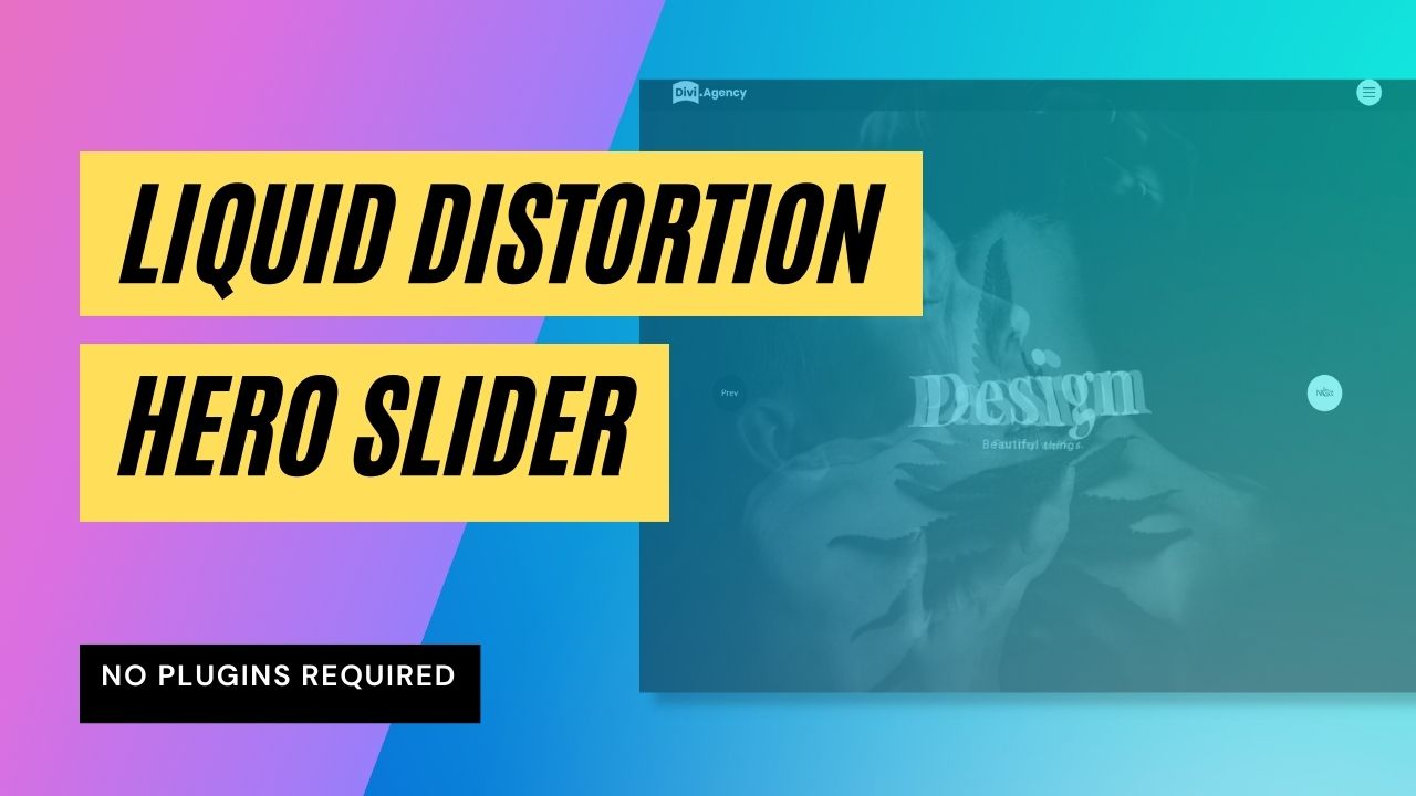
Hey Guys! Today we’re gonna check how we can implement a nice circular reveal menu animation to our Divi menus. Here is a desktop preview of the final result:
Description
As you can see from the preview, there are quite a few things going on here:
- The hamburger menu is transformed into a cross on click using a fluid animation.
- The background color of the hamburger menu is changing when the menu is clicked.
- The main animation: the circular reveal effect that cover the whole page once the menu is open.
- The staggering reveal animation of each menu item.
- The hover effects applied on each menu item.
I’ll try to quickly review each of these animations in the video below. To get the most of it, a good overall knowledge of CSS and JavaScript is required to dive into the code. But don’t worry if you are not a coder, you’ll still be able to apply the menu to your website and change the colors to match your brand.
Here are some of the skills we are going to learn today:
- How flexbox can be usefull to create a responsive navbar
- How CSS grid can be used to center-align our content.
- How to use CSS variables to quickly change the colors of our menu.
- How to leverage the CSS Animations capabilities by using @keyframes animations.
- How to reduce FOUC (flash of unstyled content).
- How to stagger animations with CSS by assigning a dynamic animation-delay to each elements we want to trigger.
- How to quickly import an external JS librairy in our page. In this tutorial we are gonna use this free librairy to control the circular reveal animation: https://github.com/VoloshchenkoAl/revealer
- How to apply data-attributes to manage our menu states.
Custom CSS
Here is the custom CSS used in this layout. Whenever you need to copy/paste it to your website, you can quickly do it by pressing the button below the code window, and it will copy all the code to your clipboard.
To quickly understand it, I separated it into 4 parts:
- The CSS variables applying to the :root of our document
- All the CSS applying to the frontend menu
- The keyframes animations
- All the CSS applying to the Visual Builder view only (and reduce the mess that custom codes can create on our backend).
<style>
/*
Template: Circular Reveal Menu for Divi
Author: Maxime Beguin
Company: Divi Agency
URL: https://divi.agency/
Version: 1.0.1
Licence: MIT
*/

:root {
  --dacm__hamburger-menu-strikes-color__closed: #fff;
  --dacm__hamburger-menu-bg-color__closed: #000;
  --dacm__hamburger-menu-strikes-color__open: #fff;
  --dacm__hamburger-menu-bg-color__open: red;
  --dacm__menu-hover-strike: red;
  --dacm__menu-order-number: red;
}

 /* AVOID FOUC */

.dacm__menu-row-content.no-fouc{
  display: none;
  opacity: 0;
  visibility: hidden;
}

/* NO BODY SCROLLING WHEN MENU IS OPEN*/

body.dacm__menu--open{
  overflow: hidden !important;
}

/* DESKTOP MENU ALWAYS HIDDEN*/

.dacm__section .dacm__menu-row-content .et_pb_menu .et_pb_menu__menu,
.dacm__section .dacm__menu-row-content .et_pb_menu .mobile_menu_bar {
  display: none !important;
}


/* MOBILE MENU ALWAYS VISIBLE*/

.dacm__section .dacm__menu-row-content .et_pb_column{
  display: none !important;
}
.dacm__section .dacm__menu-row-content.visible .et_pb_column{
  display: flex !important;
}
.dacm__section .dacm__menu-row-content .et_pb_menu .et_mobile_nav_menu,
.dacm__section .dacm__menu-row-content .et_pb_menu .et_mobile_menu {
  display: block !important;
  position: relative;
  width: 100%;
  height: -webkit-fit-content;
  height: -moz-fit-content;
  height: fit-content;
  margin: 0;
}


/* MOBILE MENU */

.dacm__section .dacm__menu-row-content .et_pb_menu .et_mobile_menu {
  -webkit-box-shadow: none;
  box-shadow: none;
  counter-reset: menuOrder;
  padding: 0;
}

.dacm__section .dacm__menu-row-content .et_pb_menu .et_mobile_menu li {
  list-style: none;
  position: relative;
  display: flex;
  align-items: center;
  justify-content: center;
}

/* STAGGERING THE MENU ITEMS ON CLICK */

.dacm__section .dacm__menu-row-content .et_pb_menu .et_mobile_menu li a
{
  padding: 10px 0 !important;
  text-align: center;
  animation: 0.5s fade-out ease forwards;
  opacity: 1;
  animation-delay: calc(var(--order) * 100ms);
}

.dacm__section .dacm__menu-row-content[data-open='true'] .et_pb_menu .et_mobile_menu li a{
  animation: 0.5s fade-in ease forwards;
  opacity: 0;
  animation-delay: calc((var(--order) * 100ms) + 300ms);
}

/* SET NUMBERS BEFORE EACH MENU ITEM */

.dacm__section .dacm__menu-row-content .et_pb_menu .et_mobile_menu li a:before {
  counter-increment: menuOrder;
  content: counters(menuOrder, "", decimal-leading-zero);
  position: absolute;
  font-size: 14px;
  top: 5%;
  color: var(--dacm__menu-order-number);
  margin: 0 0 0 -35px;
  ;
}

/* HOVER ANIMATION ON MENU ITEMS*/

.dacm__section .dacm__menu-row-content .et_pb_menu .et_mobile_menu li a:hover::after {
  opacity: 1;
  transform: scale3d(1, 1, 1);
}

.dacm__section .dacm__menu-row-content .et_pb_menu .et_mobile_menu li a::after {
  content: '';
  width: 100%;
  top: 50%;
  height: 5px;
  background: var(--dacm__menu-hover-strike);
  position: absolute;
  left: 0;
  opacity: 0;
  transform: scale3d(0, 1, 1);
  transition: transform 0.3s, opacity 0.3s;
  transform-origin: 100% 50%;
}


/* HAMBURGER MENU */

.dacm__section .dacm__menu-row .dacm__menu-container input[type=checkbox] {
  -webkit-appearance: none;
  appearance: none;
  opacity: 0;
}

.dacm__section .dacm__menu-row .dacm__menu-container .hamburger {
  width: 50px;
  height: 50px;
  margin: 0 auto;
  display: -webkit-box;
  display: flex;
  -webkit-box-pack: center;
  justify-content: center;
  -webkit-box-align: center;
  align-items: center;
  position: relative;
  z-index: 999;
  border-radius: 50%;
  background-color: transparent;
  cursor: pointer;
  -webkit-animation-duration: 300ms;
  animation-duration: 300ms;
  -webkit-animation-timing-function: ease;
  animation-timing-function: ease;
}

.dacm__section .dacm__menu-row .dacm__menu-container .hamburger-init {
  -webkit-appearance: none;
  -moz-appearance: none;
  position: absolute;
  width: 100%;
  height: 100%;
  z-index: 2;
  cursor: pointer;
  outline: none;
  transition: background-color 250ms linear;
}

.dacm__section .dacm__menu-row .dacm__menu-container .menu {
  position: relative;
  width: 100%;
  height: 100%;
  display: -webkit-box;
  display: flex;
  -webkit-box-orient: vertical;
  -webkit-box-direction: normal;
  flex-direction: column;
  justify-content: space-around;
  -webkit-box-align: center;
  align-items: center;
  padding: 13px;
  border-radius: 50%;
  background-color: var(--dacm__hamburger-menu-bg-color__closed);
  transition: background-color 250ms linear;
}

.dacm__section .dacm__menu-row .dacm__menu-container .menu .bar1,
.dacm__section .dacm__menu-row .dacm__menu-container .menu .bar2,
.dacm__section .dacm__menu-row .dacm__menu-container .menu .bar3 {
  width: 100%;
  height: 2px;
  background: var(--dacm__hamburger-menu-strikes-color__closed);
  -webkit-transition: all .3s;
  -o-transition: all .3s;
  transition: all .3s;
}

/* CHANGE THE HAMBURGER COLOR WHEN THE MENU IS OPEN */

.dacm__section .dacm__menu-row .dacm__menu-container .hamburger-init[data-open='true']~.menu {
  background-color: var(--dacm__hamburger-menu-bg-color__open);
}

.dacm__section .dacm__menu-row .dacm__menu-container .hamburger-init[data-open='true']~.menu .bar1,
.dacm__section .dacm__menu-row .dacm__menu-container .hamburger-init[data-open='true']~.menu .bar2,
.dacm__section .dacm__menu-row .dacm__menu-container .hamburger-init[data-open='true']~.menu .bar3 {
  background: var(--dacm__hamburger-menu-strikes-color__open);
}

/* TRANSFORM THE HAMBURGER IN A CLOSE BUTTON WHEN THE MENU IS OPEN */

.dacm__section .dacm__menu-row .dacm__menu-container .hamburger-init:checked+.menu .bar1 {
  -webkit-transform: translateY(7px) rotate(45deg);
  transform: translateY(7px) rotate(45deg);
}

.dacm__section .dacm__menu-row .dacm__menu-container .hamburger-init:checked+.menu .bar2 {
  opacity: 0;
}

.dacm__section .dacm__menu-row .dacm__menu-container .hamburger-init:checked+.menu .bar3 {
  -webkit-transform: translateY(-9px) rotate(-45deg);
  transform: translateY(-9px) rotate(-45deg);
}


/* MENU ROW 1 (WITH LOGO & HAMBURGER) */

.dacm__section .dacm__menu-row .et_pb_column {
  display: -webkit-box;
  display: flex;
  -webkit-box-align: center;
  align-items: center;
}


/* MENU ROW 2 (WITH THE MENU) */

.dacm__section .dacm__menu-row-content {
  display: grid;
  place-items: center;
  position: fixed !important;
  overflow: hidden;
  z-index: 1;
  top: 0;
  left: 0;
  width: 100%;
  height: 110%;
  box-sizing: border-box;
  visibility: visible;
}
.dacm__section .dacm__menu-row-content:after{
  content: none;
}


/* KEYFRAMES ANIMATIONS*/

@keyframes fade-in {
  from {
    transform: translateY(40px);
    opacity: 0;
  }
  to {
    transform: translateY(0);
    opacity: 1;
  }
}

@keyframes fade-out {
  from {
    transform: translateY(0);
    opacity: 1;
    visibility: visible;
    display: block;
  }
  to {
    transform: translateY(-40px);
    opacity: 0;
    visibility: hidden;
    display: none;
  }
}


/* VISUAL BUILDER ONLY */

.et-fb-root-ancestor .et-db #et-boc .et-l .dacm__section,
.et-fb-root-ancestor .et-db #et-boc .et-l .dacm__section .dacm__menu-row-content{
  position: static !important
}

.et-fb-root-ancestor .et-db #et-boc .et-l .dacm__menu-row-content.no-fouc{
  display: grid;
  opacity: 1;
  visibility: visible;
}

.et-fb-root-ancestor .et-db #et-boc .et-l .dacm__section .dacm__menu-row-content .et_pb_menu .et_mobile_menu li a {
  animation: none;
  opacity: 1;
}

.et-fb-root-ancestor .et-db #et-boc .et-l .dacm__section .dacm__menu-row-content {
  height: calc(100vh - 253px) !important;
}

.et-fb-root-ancestor .et-db #et-boc .et-l .visual-builder-onlly__code-module-style{
  display: block;
  color: #fff;
  background: #ef5858;
  border: 1px dashed #ffffff;
  padding: 20px;
  text-align: center;
}

.visual-builder-onlly__code-module-style {
  display: none;
}
</style>Custom JavaScript
And here is the custom JavaScript used. Again, if you just want to copy/paste the code, feel free to use your Copy to Clipboard button below the code window.
It is structured as below:
- Import the external JS library we are using to control the circular reveal effect.
- Define the variables we are going to use inside our functions.
- The function to reduce the FOUC.
- The function to add a custom “–order” property to enable our staggering effect on the menu items.
- The function that manipulate the DOM and insert our “revealed” row just after our hamburger menu.
- The Init function required by our external JS librairy.
- The function that manage the menu states by changing the data-attributes of our hamburger menu.
<script src="https://cdn.jsdelivr.net/npm/[email protected]/dist/index.iife.js" crossorigin="anonymous" referrerpolicy="no-referrer"></script>
<script>
/*
Template: Circular Reveal Menu for Divi
Author: Maxime Beguin
Company: Divi Agency
URL: https://divi.agency/
Version: 1.0.1
Licence: MIT
*/

jQuery(document).ready(function ($) {
  setTimeout(function(){

    // Variables
    const menuItems = document.querySelectorAll('.dacm__section .dacm__menu-row-content .et_pb_menu .et_mobile_menu > li > a');
    const actionBtn = document.querySelector('.hamburger-init');
    const rowContent = document.querySelector('.dacm__menu-row-content');
    const body = document.body;

    // Avoid FOUC
    rowContent.classList.remove('no-fouc');

    // Add delay to each menu links
    for (var i = 0; i < menuItems.length; i++){
      $(menuItems[i]).css('--order', i);
    };

    // Insert the menu content inside the hamburger menu
    $('.dacm__menu-row-content').insertAfter('.dacm__menu-row .hamburger');

    // Ciruclar Reveal Init
    const revealerNav = window.revealer({
      revealElementSelector: '.dacm__menu-row-content',
      options: {
        anchorSelector: '.hamburger-init',
      },
    });

    // Hamburger Animation + reveal effect
    actionBtn.addEventListener('click', () => {
      if (!revealerNav.isRevealed()) {
        revealerNav.reveal();
        actionBtn.setAttribute('data-open', true);
        rowContent.setAttribute('data-open', true);
        rowContent.classList.add('visible');
        body.classList.add('dacm__menu--open');
      } else {
        actionBtn.setAttribute('data-open', false);
        rowContent.setAttribute('data-open', false);
        setTimeout(function(){
          revealerNav.hide();
          rowContent.classList.remove('visible');
          body.classList.remove('dacm__menu--open');
        }, (menuItems.length * 100) + 300)
      }
    });
  });
});
</script>Additional Notes
This menu hasn’t been built to manage submenus. The reason for this is it would require a lot of extra CSS work that goes way behind the purpose of this article. So if you’re planning to use submenu’s, I’d recommend choosing another solution – this one won’t probably be a good fit.
Change logs
v1.0.1 (29/08/2021):
- Fixed an issue where the menu would overflow the body of the website even on a closed status on Safari (both on macOS and iOS).
- Fixed an issue where the hamburger icon would scroll when the menu is opened if the section is set to relative position instead of fixed. Added on overflow:hidden property to the page body when the menu is open.
v1.0.0 (19/08/2021):
- Initial public release
Final Thoughts
I don’t know if you are like me, but one of the first thing I check on a website is the menu experience. That’s generally the first thing the visitors are going to see of your website, thus it takes a big part in the first impression you’re going to build over the business behind it. Adding a subtle animation to it should increase the curiosity of your visitors and the overall user experience. And as a designer, I love to add good-looking and creative animations to my designs. It just makes it feel more professional!
Well guys and gals, I hope you liked this first freebie and learned something new today that will add value to your next Divi project! Let me know what you think in the comments below, and I hope to see you soon for my next Divi freebie!


So my default homepage is https://www.goodtobehomepetsitting.com/ which has my default website template. I created a new template in theme builder with your fantastic design and attached it to https://www.goodtobehomepetsitting.com/home2/.
So I also I have 2 different domains. I first uploaded the menu to my other site and was loving your design, still do, but when went to uploaded it to my main website the logo ended up being centered on the screen. I double checked that it was full wide and it is now but the logo is still centered. Also the top of the page is underneath your menu so need to get that fixed. So those 2 issues I need help with.
Thanks for your menu, I love it, and congrats on your first freebie. It’s a lot better than most out there in my mind.
Thanks
Hey Micheal, thanks for reaching out!
I just checked your home2/ page and found the fix for both your issues:
1) The logo is centered because the image module has margin-left set to “auto”. Make sure to set margin-left to 0 and it should be fixed.
2) The top of the page is underneath the menu because we are using a fixed menu – which stays sticky on top when scrolling. To solve the issue you have 2 possibilities: add a padding-top to your page in order to create some space for the menu OR disable the fixed menu by opening the section of the menu -> advanced tab -> position -> and change the position from “fixed” to “relative”.
Let me know if that worked for you!
Maxime I will apply these fixes and let you now. Thank you for the quick response.
Maxime I can’t get any of your ideas to work.
Logo issue – I tried changing the margins and couldn’t get it to move. Through DevTools I saw I think in .et_pb_image section where you were talking about I changed that auto value to zero it did send logo left. I couldn’t find that value in you CSS file so I copied the DevTools code
.et_pb_image_0_tb_header.et_pb_module {
margin-left: 0!important;
margin-right: auto!important;
}
Into your CSS file module and it wasn’t stable. So I took it out.
On the web page under menu issue:
I went through the options you mentioned and couldn’t get it to work.
Can you make the adjustments in your CSS files and send them to me the whole file to copy and replace what you have in the divi module?
Also, could you look at the menu itself where the black background is. The menu is a nightmare. Doesn’t line up centered on the page. I tried getting that to center up. But I couldn’t
The center issue of the menu is coming from your submenus. This particular menu hasn’t been designed to support submenus. I’m planning to publish other menus that fully support submenus in the future – both supporting desktop and mobile views. If you need submenu’s, I’m afraid this particular menu might not be a good fit – except if you are willing to add extra CSS and adapt the JS file for the animation.
You should not need to add extra CSS here. The auto!important is probably coming from one of this 2 locations:
– the image module -> design tab -> alignment -> center.
– the image module -> design tab -> size -> module alignment -> center.
If you remove the alignment, the margins should apply inside the Visual Builder. Make sure to add 0 in margin-left.
For the page padding, make sure to enable the Visual Builder in /home2/ and add the padding-top on the first section of the page (in your case the section that contains a fullwidth header module).
To apply the padding sitewide, you could add the following css to your theme customizer or child theme:
#et-main-area .et_pb_section:first-child {
padding-top: 90px;
}
Hey that’s a bummer Maxime about the sub menus. They are kindof important in my case. Could you make sure I am on an email list for your products. I will be looking for the sub menus version.
Thanks for all your doing. It’s a great menu!
I can confirm your email is correctly added to the freebie newsletter 🙂
This is a really cool menu, thank you for making it and the awesome tutorial on outlining the lines of code 🙂
I would like to change the strike feature to be more of an underline… do I just change the % of top (and maybe the height)?
the css for it seems to start at 116…
.dacm__section .dacm__menu-row-content .et_pb_menu .et_mobile_menu li a::after {
content: ”;
width: 100%;
top: 50%;
height: 5px;
background: var(–dacm__menu-hover-strike);
position: absolute;
left: 0;
opacity: 0;
transform: scale3d(0, 1, 1);
transition: transform 0.3s, opacity 0.3s;
transform-origin: 100% 50%;
}
Hey April, that’s correct. If you change the “top: 50%” to something like “top: 90%” the strike will be an underline.
Hi. I’m trying to import the .json file to my test site and it seems to load as I get the 100% and green checkmark but then it goes right into a 2nd upload and hangs at 100%. I’ve made sure site health is fine and the builder worked fine the other day… not sure what else to check. Any help would be appreciated. Many Thanks 🙂
Are you importing it inside the theme builder, right? Did you check if you have any errors in console logs? Not sure it’s related to the JSON itself… I’d probably try to disable the plugins one by one and see if it makes any difference. If that doesn’t work, you’d probably need to contact the official support.
Yes, I am importing it inside theme builder… no errors that I can see. I will investigate further though. I do have another global header for other pages – that wouldn’t affect it would it?
It shouldn’t affect the import of other custom headers. Sorry April, I can’t replicate the issue on our servers. I would try to hear what the ET support has to say about it. Please come back to me if it appears to be somehow related to our JSON and I’d be happy to dig further.
how can i make the Header Transparent?
Hey Ahmed, in order to make the navbar transparent, open the row’s settings and change the background color to transparent – rgba(0,0,0,0). Let me know if it does the trick for you!
Hey, love the work you do, very interesting. I was wondering if I could just get the code without all the extra. Just the code that hides mobile menu hamburger icon, the code for the open/close hamburger icon movement, the transition code for the menu when it displays, and the part of the code that opens the menu when you click on the custom hamburger icon. I would be willing to pay you. I tried trimming and editing the code down to just the basic stuff that I need and I could not get it to work. What I am wanting to do is have the mobile menu open when I push this:
and I want it to hide the current plain (boring) divi hamburger icon. I also like the transition and want to be able to play around with it so that I can do things like just have it slide down or slide from the right. I build a lot of websites with divi and I am tired of use the same little code to get by. trying to have more code readily available to use. If you could please help me that would be great.
Hey Chris, Thanks for your feedback! Feel free to purchase 1 hour of support here: https://divi.agency/white-label-services/#pricing and I’ll be happy to tweak the code per your needs.
Hey Maxime,
this design looks magnicent and I’d like to use it on one of my websites. I can’t import it into the Divi Theme Builder, on none my websites.
I’ve already contacted Divi support and they confirmed that the file seems to be corrupted. Can you maybe take a look into this?
Thanks 🙂
Hey Ingo, I just tried to redownload the zip file and import the JSON inside the Divi theme builder header and I experienced no issues. Could you share more details on the errors you are getting and the steps you followed in order to reproduce them?
Thanks.
Hi Maxime,
This is a great interaction.
I’ve incorporated this into a website that I’m building and it works great on desktop, however, on @mobile display the menu does not reveal and I’m struggling to identify the issue.
I’d be very grateful if you can take a quick look?
https://featurecoatings.com.au/
p/w to view page: FCA1112!
Many Thanks,
Hey George,
I had a quick look at your page. The problem comes from the transform:scale settings you applied on the code module inside your navbar. If you remove the scale options, it should work as expected. If you need to scale down the hamburger menu, you could target the following class:
@media screen and (max-width: 767px){

.dacm__section .dacm__menu-row .dacm__menu-container .hamburger{

transform: scale(0.7);

}

}
Let me know if that works for you!
Maxime
Thank you so much Maxime,
That’s fixed it.
Really appreciate it!!
Great! I’m happy it worked for you!
Hi Maxime,
Is there a way to get the menu to collapse when clicking on an ‘anchor’ menu link?
Currently I’m using an anchor link for ‘Contact’ which anchors to the correct section, however, the menu remain opens.
Thanks so much
Hey George,
That would require some additional JavaScript, but it’s pretty doable. If you need any customization on your site, feel free to contact me by email for a quote.
Hi Maxime, I’ve finally got round to using this great menu on a site I’m building. However it won’t let me add the logo as SVG. (I have already allowed for svg uploads) but when I add into the logo module I can see it in the theme builder but not on the front end. Any idea how I can get around this please? Website in question is https://joesherno.co.uk where you’ll see I’m currently using a png file.
Hey Gaby,
I can’t really debug the issue if there is no SVG on your site right now… Would you share a page where the SVG is used as the logo? I suspect it happens because no explicit width/height is set on the image module. But for further debugging, it would really help if you could share an URL with the error.
Thanks.
Thanks Maxime, you were correct. All fine now I’ve added width 🙂